UNTYPE:
Anti-ai typography micro-site
WEBSITE DESIGN | VISUAL STORYTELLING | BRANDING
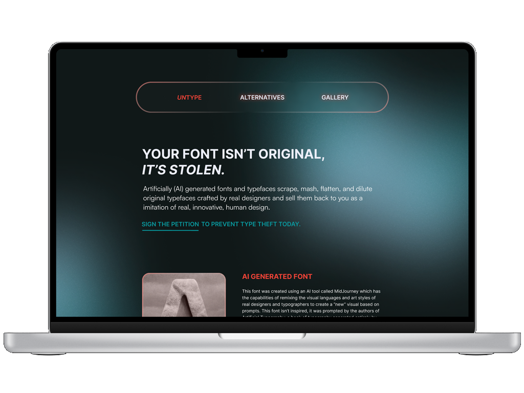
A service design project created to inform designers, typographers, and the general public about the growing risks and ethical concerns surrounding AI-generated typography and fonts. In response to the rapid rise of artificially generated typefaces (often lacking transparency around copyright, authorship, and creative source material which include real and non-consenting designers), this website functions as a disruptive pop-up experience designed to provoke awareness and conversation. The guerrilla-style activism experience designed with a grungy, bold, in-your-face visual language functions as a successful reaction to artificial intelligence.
Site architecture:
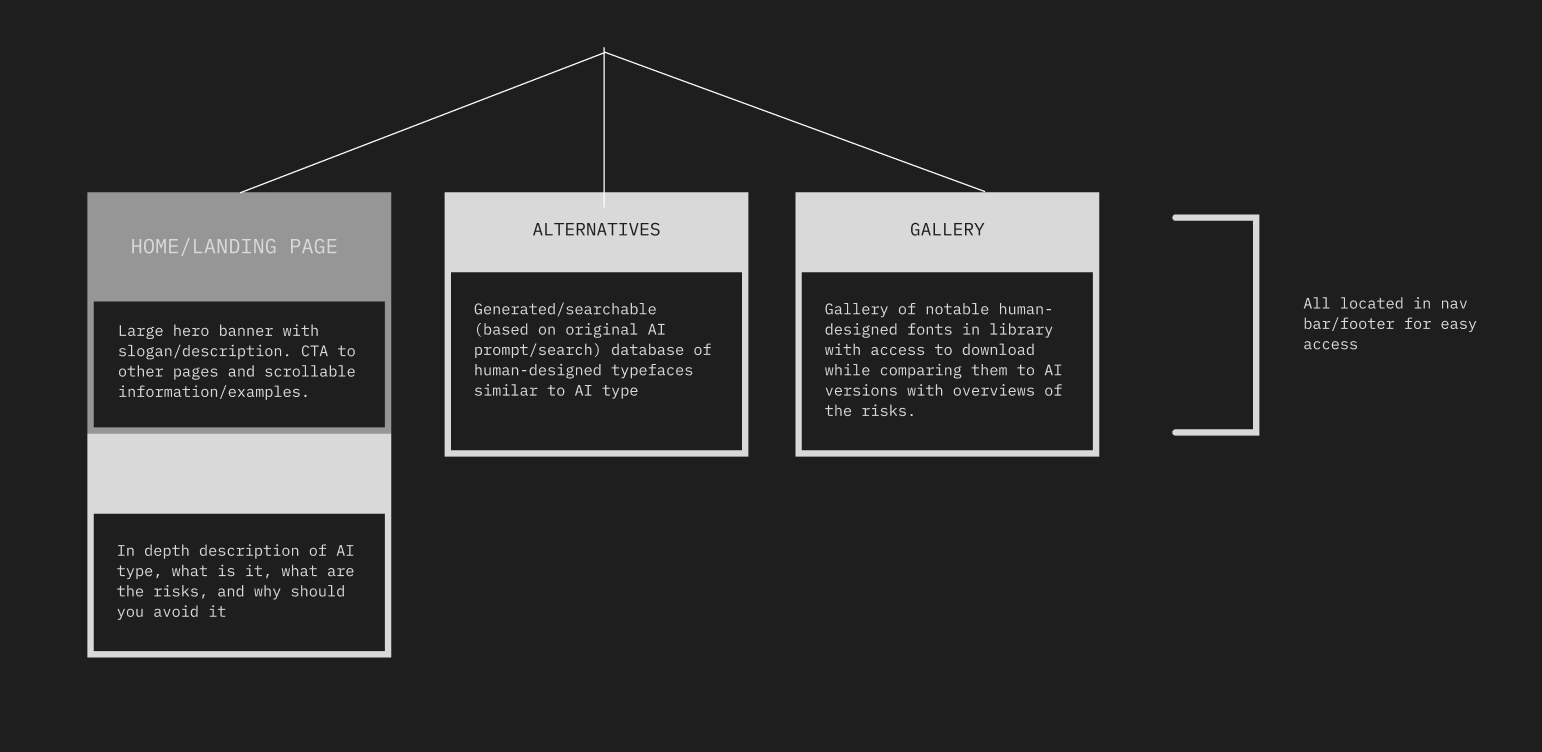
This section covers what goes where on the site. The architecture explores the flow of information, user interaction, and disruption throughout the experience. The structure was intentionally designed to feel invasive and slightly chaotic while still guiding users through key educational and activist-driven touch points.
VISUAL IDENTITY:
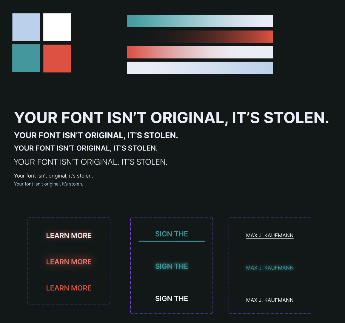
Following architecture was the visual identity which included colors, typography (not ai-generated, obviously), naming/voice, gradients and button states for interactivity.
The overall look and feel for UNTYPE was essential for its success in communicating the mission. I leaned into grainy, human-inspired textures and drew inspiration from protest graphics, print culture, and high-contrast compositions.
THE Prototype:
Putting it all together into the final interactive prototype showed the use-case for this piece and how effective the site is at communicating the message when integrated.
The full micro-site is linked here. Make it full screen and take some time to explore and learn about the consequences of ai-generated typography and even find some beautiful alternatives.